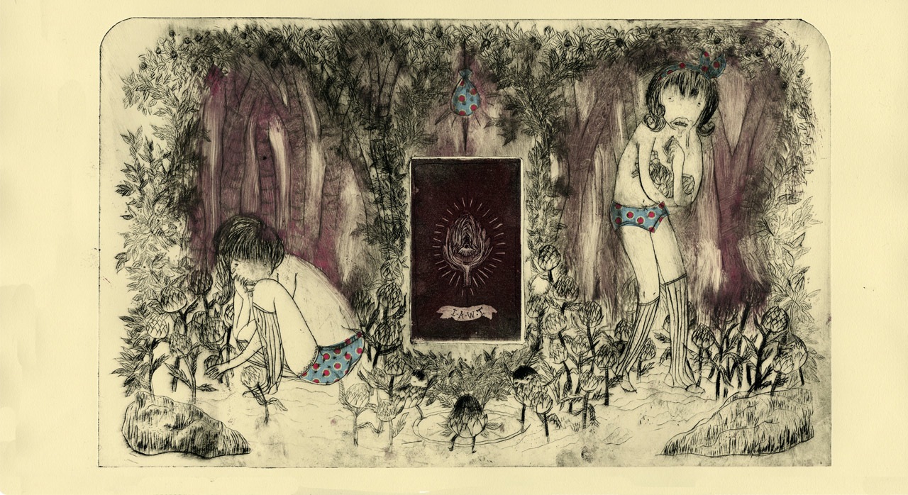
Sunday, March 24, 2013
Post 9 - Collagraph
Artist: Sue Brown
Medium: collagraph
Lives in Britain, does printmaking and enameling, is inspired by natural and social history, and says she "would be lost without textured wallpaper."
Color in the two collagraphs lend a sort of warm, old-fashioned, antique-y feel to the prints. Not sure if the artist printed on colored paper or just used a ton of different inks. After having the experience of making my own collagraph, I have a greater appreciation for them and what goes into making them and I like that the artist used multiple colors in hers.
Post 8 - Collagraph
Artist: Hannah Soukup (http://www.behance.net/gallery/Printmaking/6310379)
Title:"The Bottom of Her Ocean" and "Floating Fillaments"
Medium: Collagraph
Whoa, so textured, looks like your skin would catch on something if you ran your hand across it. Simulated dry, cracked desert-y sort of texture. These collagraphs are really abstracted and striking and make me want to try to be bolder and more out of the box with my own.
Post 7 - Drypoint
pattern/repetition...
Artist: Sara Ulrich (http://www.behance.net/gallery/Birds-of-a-Feather-Non-Fictional-Illustrations/4584791)
Title: "Birds of a Feather" series
Medium: Drypoint
Ulrich is a graphic designer living in Budapest, Hungary.
Artist used plexiglass for her matrix. Pattern on the birds comes from the simplified/stylized feathers being repeated across the form. Also the echo echo echo -ing of the line work. I love how intricate these drypoints are.
Post 6 - Drypoint
Artist: Alexa Cassaro
Title: "In Artichoke We Trust"
Medium: Drypoint, Chine Colle, Jigsaw Etching
Fun, quirky print and a good example of the pencil-like, sketchy lines you can achieve with drypoint and also how different amounts of wiping with the ink can create variation in the printed picture.
Post 5 - Linocut
Artist: Michal Stroz
Title: SWC series
Medium: Linocut print
Really impressive use of texture, especially in depicting a wide range of values. It seriously looks like different levels of light to me. Really beautiful. I am crazy for these linocuts; it's so hard to believe someone actually carved all this out with their hands and not some special high tech machine.
Post 4 - Linocut
Artist: Amanda Colville
Title: Bees and Moths linocut prints
Medium: Linocut print
Lives in the UK, has a nice Etsy shop, and uses an old washing mangle for a printing press.
Artist didn't have much to say about the prints. Just that they were "lino cuts exploring the natural patterns of insects." Balance in these prints comes from the symmetry. I like them because they're like bug kaleidoscopes.
Post 3 - Linocut
Artist: Polina Tsareva (http://www.behance.net/PolinaTsareva)
Medium: linocut print
Lives in Moscow, Russia.
Artist uses positive shapes floating in the center of a blank space. The bright colors on the white sheet make the shapes seem bolder and add weight.
Post 2 - Intaglio
Artist: Ambera Wellmann (http://www.amberas.com/blog/?p=349)
Title: "Evolver"
Medium: Intaglio print (varied edition of 7)
Size: image size - 9"x12", paper size - 15"x30"
Ambera Wellmann's work consists mostly of oil paintings. She also uses various techniques of printmaking and mixed media.
Line is used to delineate the different forms, but also to create a range of value.
Friday, March 8, 2013
Post 1 - Blind Emboss
Designed by Ven Gist
Printed by Hawk Embossing
Title: "Hill or No Hill" Poster - Topography of San Francisco
Printed by Hawk Embossing
Title: "Hill or No Hill" Poster - Topography of San Francisco
Medium: 100% Cotton Acid-Free uncoated paper stock
Dimensions: 280 mm × 380 mm (11.02 in × 14.96 in)
100 prints produced
blind emboss using multi-layer brass die (15 levels)
The designer, using a 2D topographical map of San Francisco, traced it into a couple different layers and then had that turned into the multi level brass die that was used to create the piece. "Hill or No Hill" is an excellent example of the use of shape in embossing, since the artist used nothing but. Shapes are stacked on top of each other to create the terrain of San Francisco. Of course, this being a blind emboss, we see the shape of the piece because of the way the light falls. The effect is a picture drawn in lines of shadow and light. I like the concept of the poster and find the design stylish and striking.
Subscribe to:
Posts (Atom)